Irohas PhotoVisual Identity
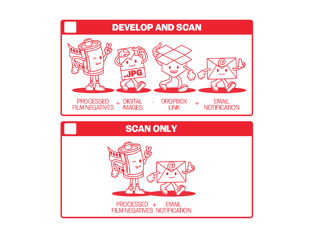
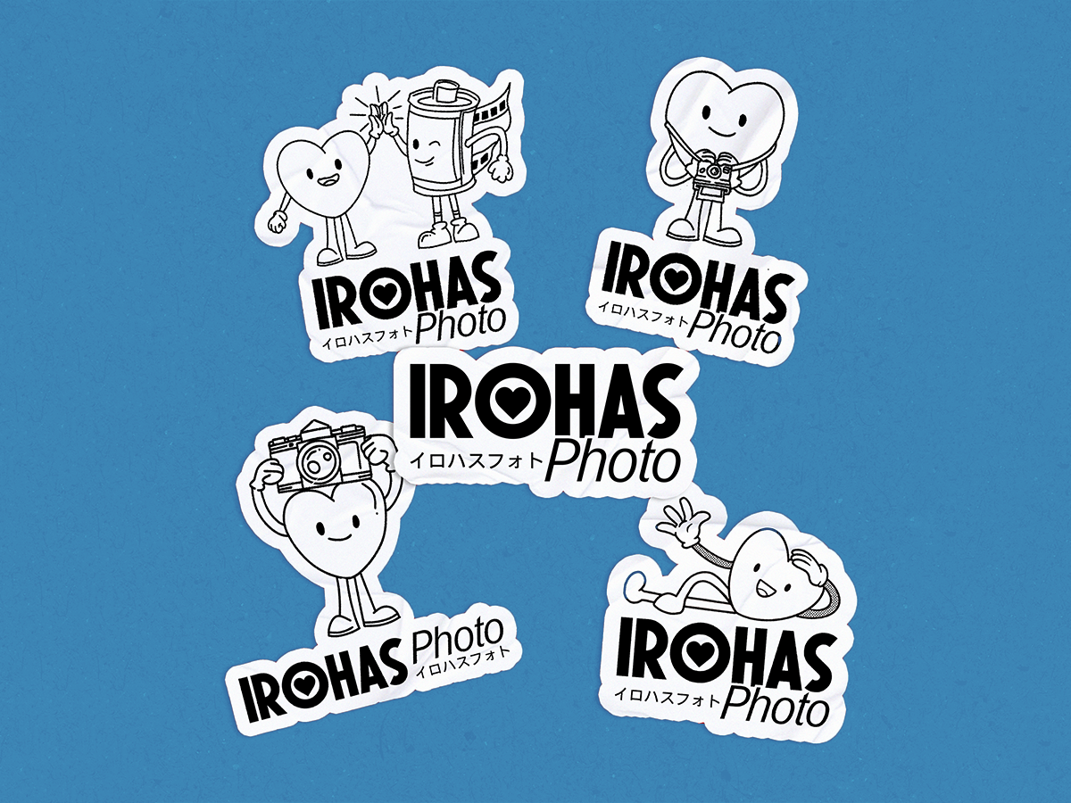
Design system
Art Direction
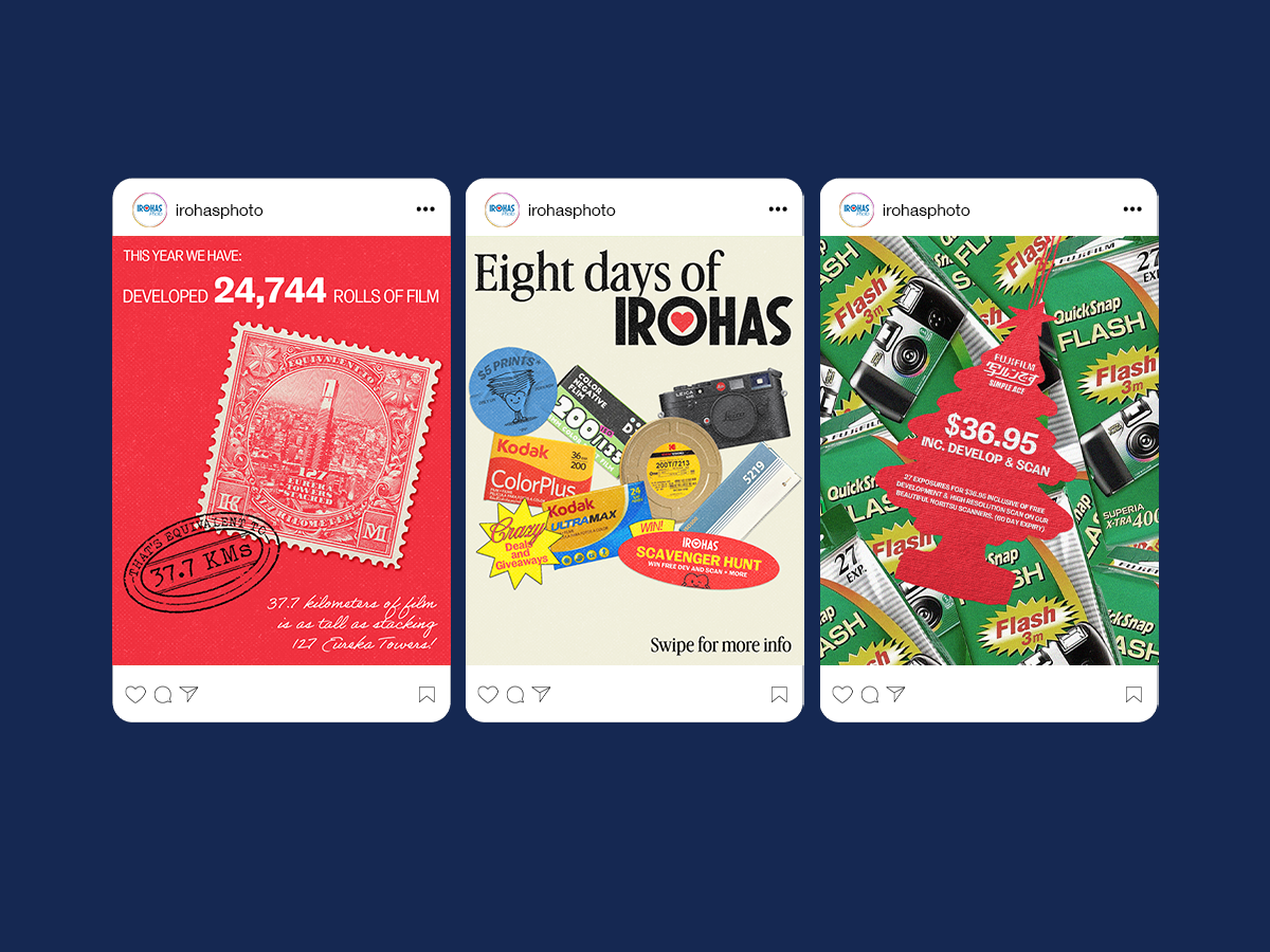
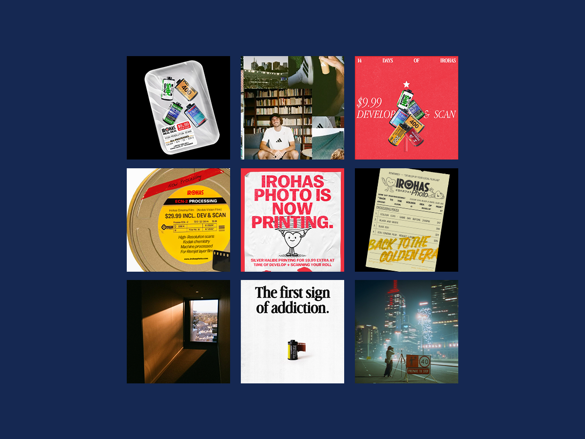
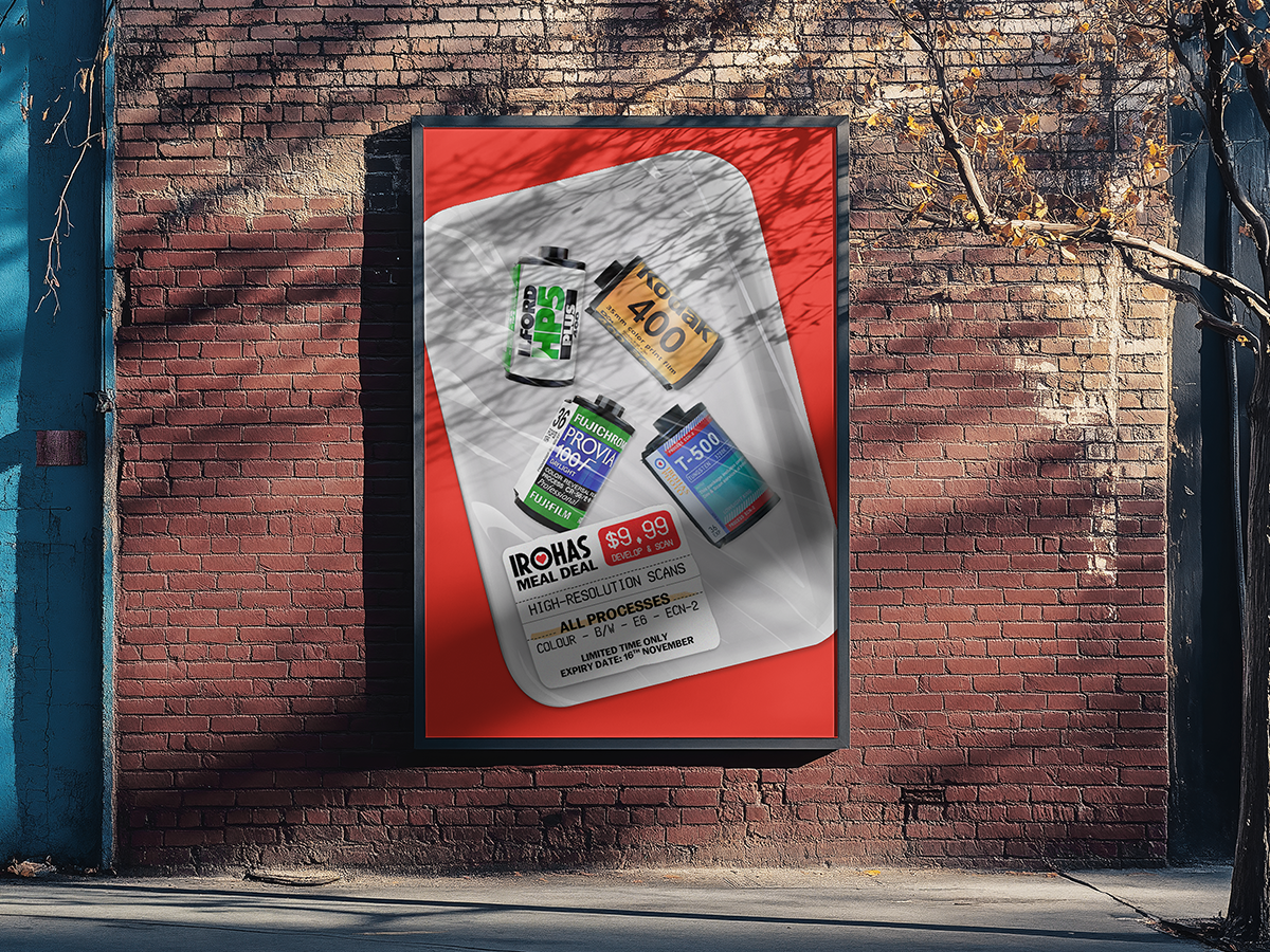
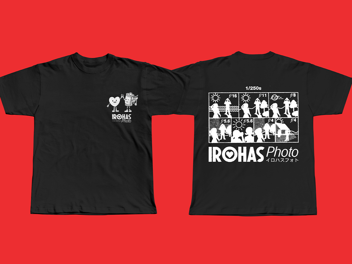
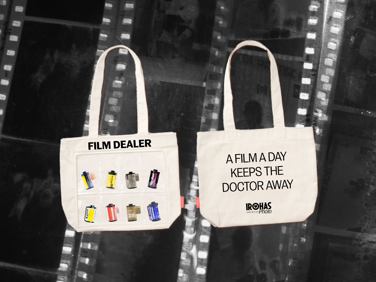
Marketing
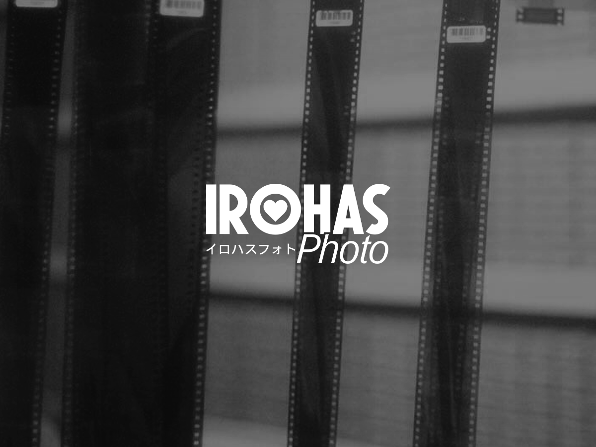
Born from a deep love of film photography, Irohas Photo started as a way to make film more accessible, what began as a simple lab quickly evolved into a hub for photographers, artists, and film lovers alike.
The name Irohas draws from the Japanese Iroha poem, symbolizing tradition and cyclical creativity. Our visual identity reflects this balance, melding the nostalgia of analog photography with a fresh, modern perspective.
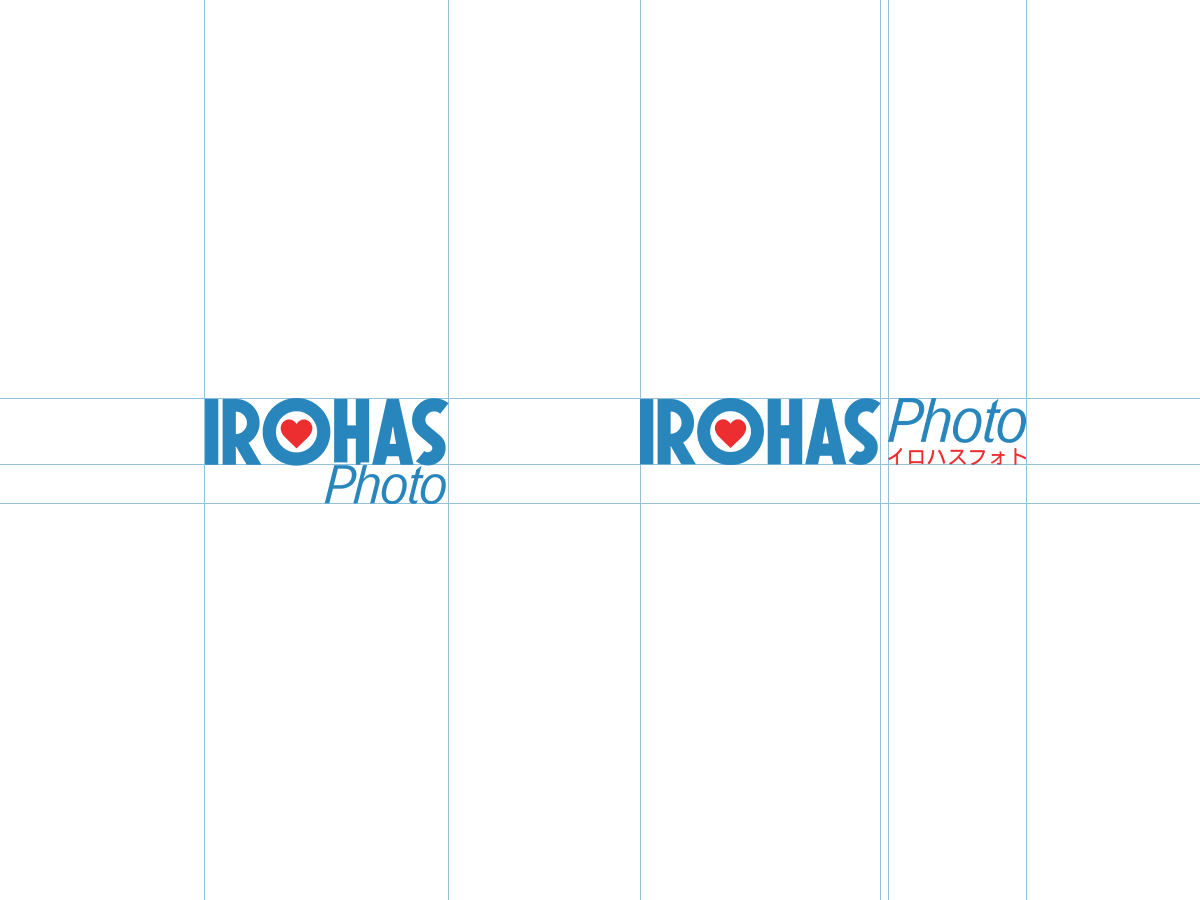
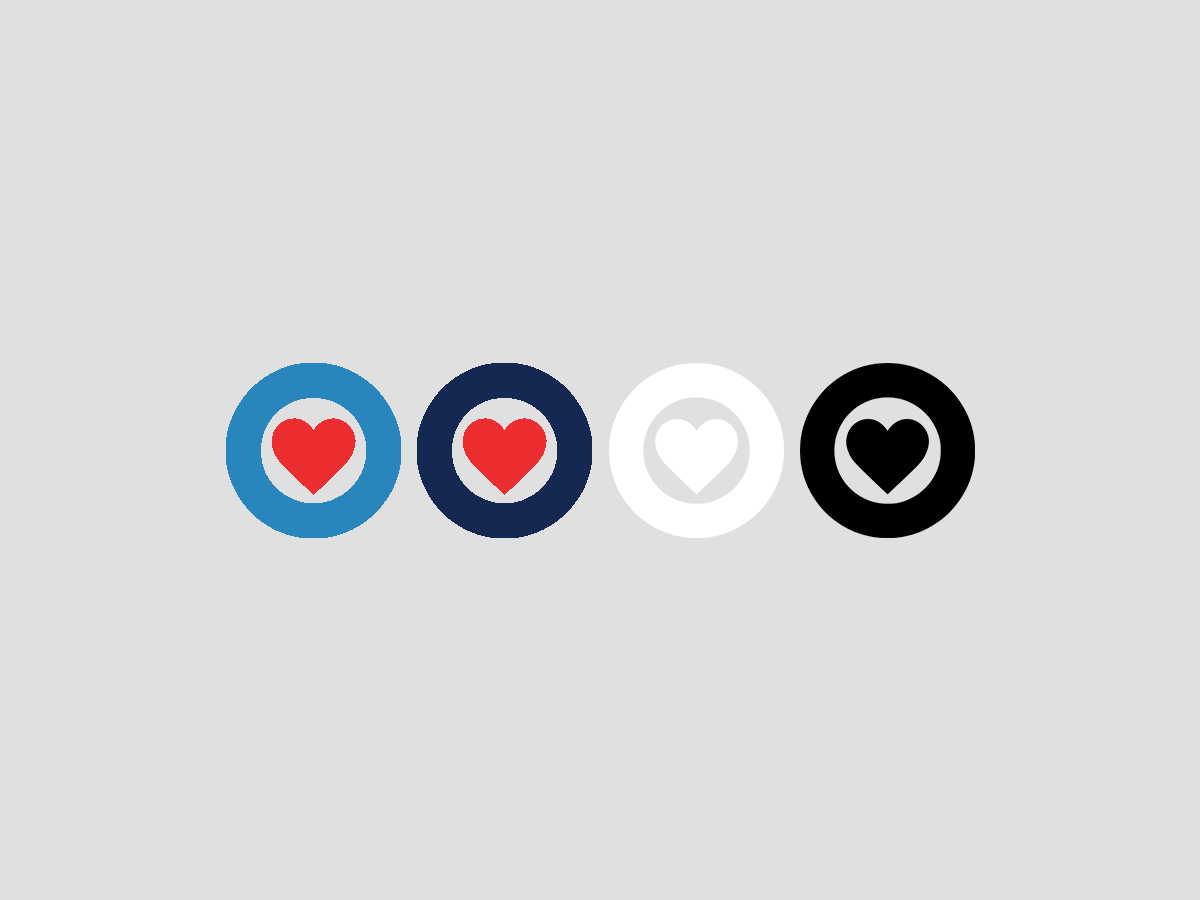
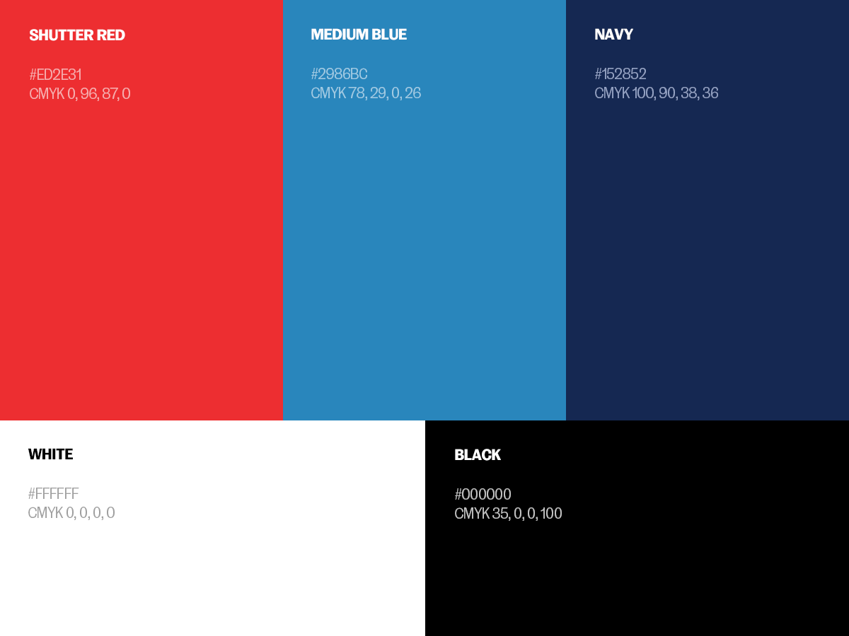
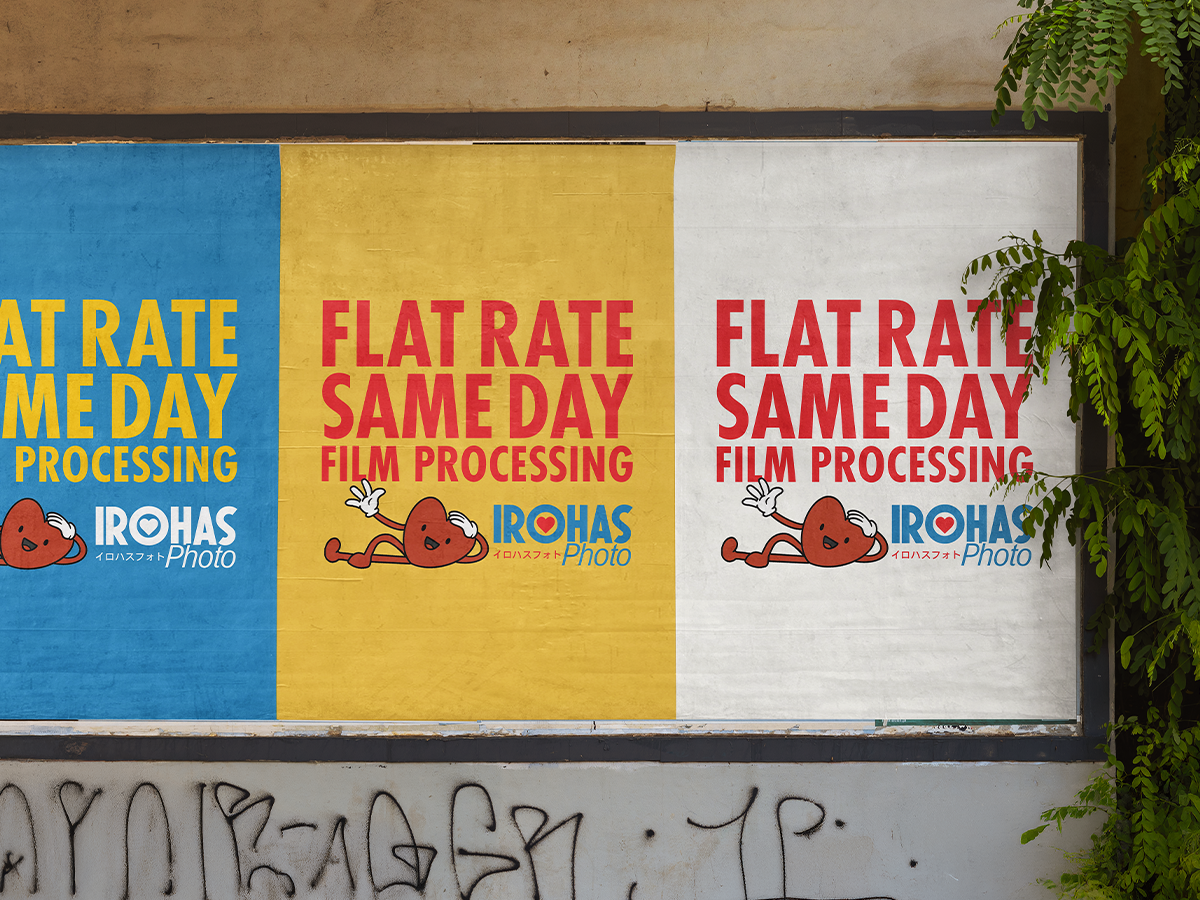
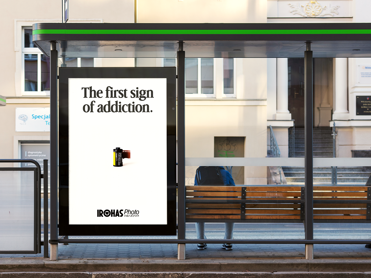
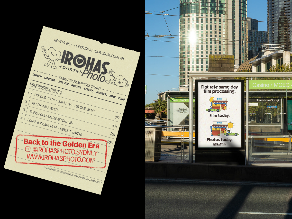
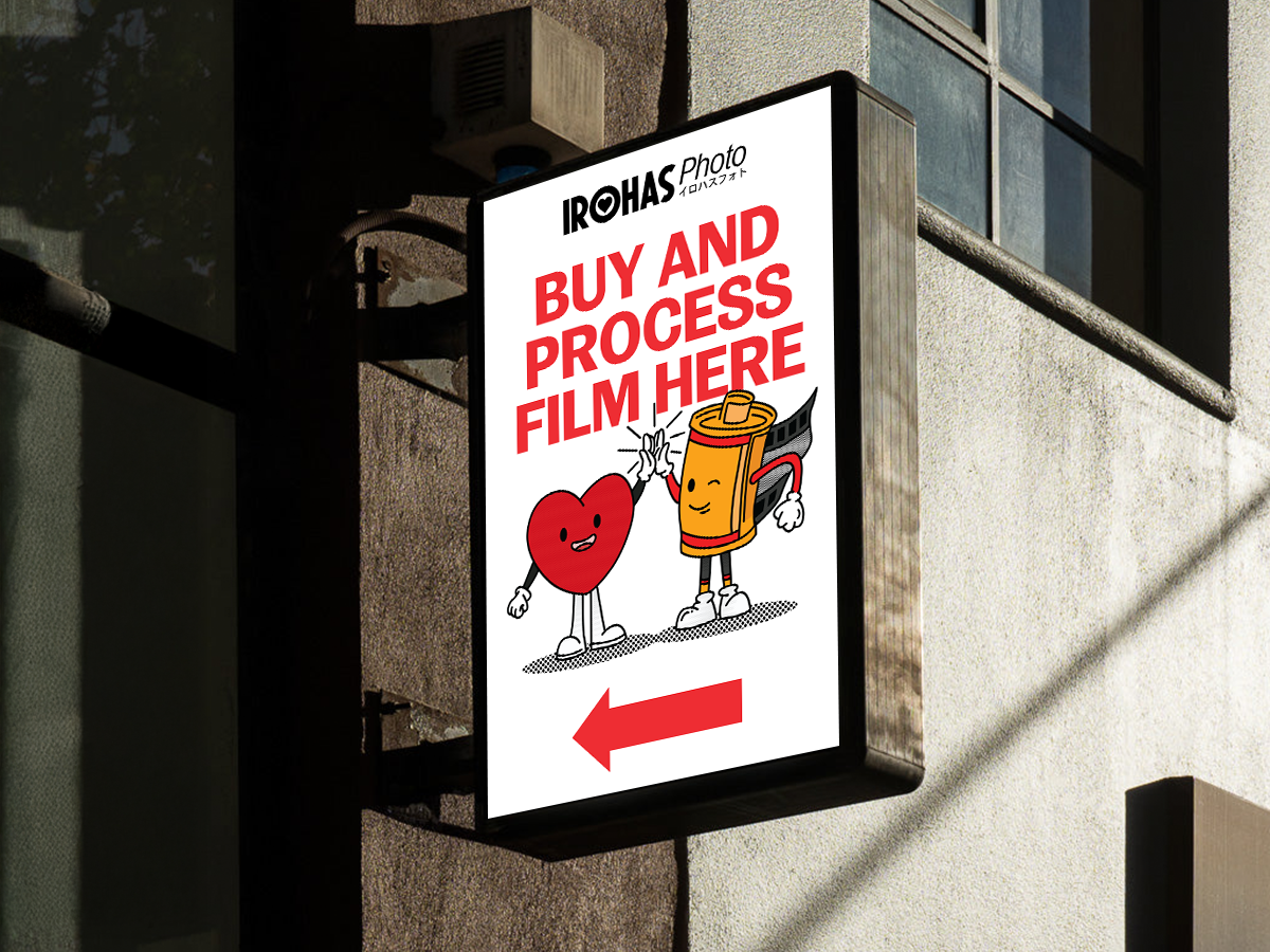
The rebrand takes cues from vintage Japanese film labs, reinterpreted through a contemporary lens. Playful yet structured typography mirrors the unpredictability of film grain, while a warm, muted color palette evokes the timeless feel of celluloid. This aesthetic extends across our packaging, store signage, and digital presence, creating a seamless experience that bridges past and present.
Irohas Photo is more than a film lab; it’s a movement to keep film alive, evolving, and inspiring the next generation of photographers.